Picture this: You're sitting in yet another boardroom, watching slide number 47 of a presentation filled with endless bullet points and raw data tables. Your mind wanders. Your coffee grows cold. Sound familiar? Now imagine a different scenario - the presenter clicks, and suddenly complex data transforms into an elegant visual story that makes everything click instantly. That's the difference visualization makes, and it's revolutionizing how we communicate in business.
The science backs this up dramatically. Our brains process visual information 60,000 times faster than text, and a staggering 90% of information transmitted to the brain is visual. No wonder 65% of businesses report that using data visualization in their pitches has significantly increased client engagement and understanding. These aren't just fancy graphics we're talking about - they're powerful tools that transform abstract concepts into concrete understanding.
Hans Rosling, the legendary statistician, put it perfectly: "Most of us need to listen to the music to understand how beautiful it is. But often that's how we present statistics: we just show the notes, we don't play the music." Modern 3d rendering service providers understand this principle intimately, creating visual symphonies from what would otherwise be flat, lifeless data. They turn spreadsheets into stories, numbers into narratives.
The Psychology Behind Visual Persuasion
Why do visuals pack such a punch? It's not just about making things pretty. Our brains are hardwired for visual processing - we've been interpreting visual cues for survival far longer than we've been reading text. When you present information visually, you're speaking the brain's native language.
Consider how a simple pie chart can instantly communicate market share distribution that would take paragraphs to explain. Or how a heat map can reveal patterns invisible in raw data. Research shows that presentations with visual content receive 94% more views than those without. That's not a marginal improvement - it's a complete game-changer.
But here's where it gets really interesting. Visualization doesn't just help people understand information; it helps them remember it. Studies indicate that people retain 65% of information when it's paired with relevant images, compared to just 10% when hearing it alone. Think about that for your next quarterly review or investor pitch.
The emotional component matters too. Well-crafted visuals trigger emotional responses that spreadsheets simply can't. A compelling infographic about market growth doesn't just inform - it excites. A beautifully rendered product visualization doesn't just explain features - it creates desire.
Breaking Down Complex Stories
Every salesperson knows the challenge: how do you explain a complex solution without losing your audience? Traditional approaches often fail because they demand too much cognitive load. Enter visualization - the great simplifier.
Take financial services, for instance. Try explaining derivative products verbally, and watch eyes glaze over. But show an interactive visualization that demonstrates how values change under different scenarios? Suddenly, comprehension soars. It's like the difference between describing a route verbally versus showing someone a map.
The best visualizations work like translators, converting complexity into clarity. They reveal relationships that would remain hidden in tables. They expose trends that would stay buried in databases. They make the invisible visible, the incomprehensible comprehensible.
Modern tools have made this translation process more sophisticated than ever. Real-time data visualization means you're not just showing static snapshots - you're demonstrating living, breathing systems. Clients can see how changes ripple through interconnected elements, understanding cause and effect in ways that would be impossible through traditional presentation methods.
The Art of Visual Storytelling
Data without context is just noise. That's why the most effective presentations don't just visualize data - they tell stories with it. Visual storytelling combines the power of narrative with the clarity of visualization, creating presentations that don't just inform but inspire action.
Start with the problem. Show it visually - maybe it's a graph trending in the wrong direction or a process diagram highlighting bottlenecks. Then introduce your solution, using visualization to demonstrate how it addresses each pain point. Finally, paint a picture of the future state - what success looks like when your solution is implemented.
This narrative arc, supported by compelling visuals, creates what psychologists call "transportation" - that feeling of being swept up in a story. When clients experience transportation, they're not just understanding your pitch intellectually; they're experiencing it emotionally. And emotion, not logic, drives most business decisions.
Progressive disclosure is another powerful technique. Instead of overwhelming viewers with everything at once, reveal information layer by layer. Start with the big picture, then zoom into specifics. Use animation to guide attention, highlighting key points as you discuss them. It's choreography for data.
Interactive Engagement Changes Everything
Static presentations are so last decade. Today's most effective pitches are conversations, not monologues, and interactive visualizations facilitate this shift beautifully. When clients can manipulate data themselves, engagement skyrockets.
Imagine presenting a pricing model where clients can adjust variables and instantly see how costs change. Or showing a project timeline they can modify to explore different scenarios. This isn't just engagement - it's co-creation. Clients become participants in building the solution, not passive recipients of a pitch.
Interactive elements also reveal client priorities through their interactions. Which features do they explore first? What scenarios do they test? These behaviors provide invaluable insights that can help you tailor your approach in real-time.
The technology enabling this interactivity has become remarkably accessible. From simple clickable prototypes to sophisticated data dashboards, the tools exist to make any presentation interactive. The question isn't whether you can add interactivity - it's whether you can afford not to.
Measuring What Matters
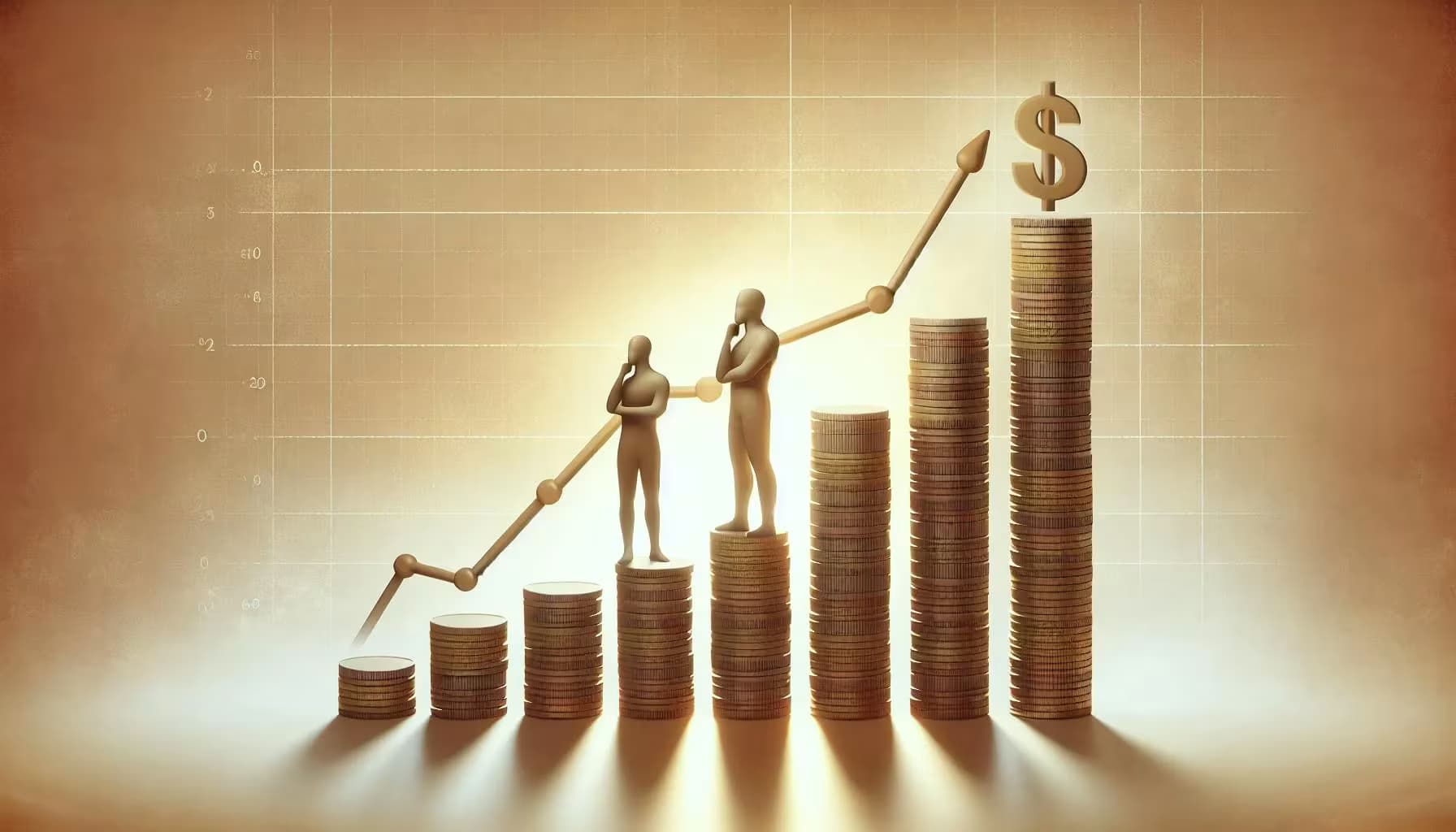
How do we know visualization actually works? The metrics speak volumes. Sales teams using visual presentations report closing deals 43% faster than those relying on text-heavy approaches. Customer comprehension scores increase by an average of 400% when complex products are explained visually rather than verbally.
But the real proof comes from conversion rates. Companies that invest in high-quality visualization for their sales materials see conversion improvements ranging from 20% to 80%, depending on the complexity of what they're selling. For technical products and services, the impact is even more pronounced.
Ben Schneiderman, a pioneer in information visualization, noted: "Visualization gives you answers to questions you didn't know you had." This insight extends to sales situations. Good visualizations don't just answer the questions clients ask - they reveal questions clients should be asking, positioning you as a thoughtful advisor rather than just another vendor.
Tools and Techniques for Modern Presenters
The toolkit for creating compelling visualizations has exploded in recent years. But with great power comes great responsibility - and the potential for great confusion. The key is choosing the right tool for your specific needs and audience.
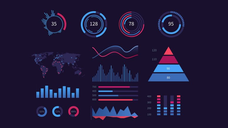
For quick and dirty visualizations, tools like Tableau or Power BI can transform raw data into presentable charts in minutes. For more sophisticated needs, specialized design tools create custom visualizations that align perfectly with your brand and message. The sweet spot often lies somewhere in between - professional enough to impress, flexible enough to adapt.
Animation deserves special mention. Used judiciously, it can guide attention and reveal information at the perfect pace. Overused, it becomes a distraction. The best presentations use animation purposefully - to show change over time, to build complex ideas step by step, or to transition smoothly between related concepts.
Don't forget about accessibility. Your visualizations should work for everyone in your audience, including those with visual impairments or color blindness. Good design is inclusive design, using multiple encoding methods - not just color - to convey information.
The Future Is Already Here
Augmented reality, virtual reality, and artificial intelligence are reshaping what's possible in presentations. AR can overlay data onto physical products. VR can immerse clients in virtual environments where they experience solutions firsthand. AI can generate custom visualizations on the fly based on client questions.
These aren't far-off possibilities - forward-thinking companies are using them today. Real estate firms use VR to tour properties that haven't been built yet. Manufacturing companies use AR to show how new equipment will fit in existing facilities. Financial services firms use AI to create personalized investment visualizations for each client.
Yet despite all this technological advancement, the fundamental principle remains unchanged: effective visualization makes the complex simple, the abstract concrete, and the boring fascinating. Whether you're using cutting-edge VR or a simple hand-drawn diagram, success comes from understanding your audience and crafting visuals that resonate with their needs and perspectives.
The companies that master visual communication will have a decisive advantage in the marketplace. They'll close deals faster, build stronger relationships, and create more memorable experiences for their clients. The question isn't whether to embrace visualization in your presentations - it's how quickly you can master it before your competitors do.