Getting Called Out by a Client
Last month, I presented the design for this kids' educational app to the client team. The lead designer, an experienced woman, pauses the presentation and says, "These icons feel disconnected. Like they're from different apps entirely."
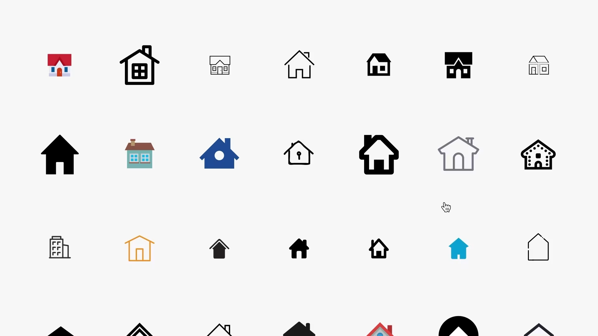
Ugh, she was right, though. I had learning icons from one source, game elements from another, and character-related items from who knows where. Each looked decent on its own, but together? Chaos. Different line thickness, some rounded, some angular, clashing visual styles. Embarrassing.
That comment prompted me to rethink my entire approach. Spent that weekend digging for better solutions, stumbled across Icons8. Initially, it looked like just another icon site boasting about their "1.42 million assets." But trying it out? Game changer.
How They Fixed the Matching Issue
Most icon sites throw everything into random buckets. "Education icons," "Games icons," whatever. Icons8 did something clever - they created these complete visual systems: 45 different families, each with thousands of icons that genuinely belong together.
I've just wrapped up a children's learning platform project and needed icons for everything, including educational games, progress tracking, character interactions, parent dashboards, and achievement systems. Went with their "Hand Drawn" style, and everything harmonized perfectly. Same line quality, matching color approach, consistent charm throughout. Usually, this icon hunting takes weeks. Here? Six hours, tops.
Technical quality also caught my attention. Their SVG code is readable—no weird nested groups, no random naming. When I need animations or path tweaks, it makes sense. Saves me tons of cleanup time.
Format Options That Cover Everything
They provide PNG, SVG, PDF, EPS, PSD, AI - every format you'd need. Helpful since I'm constantly switching between web work (requiring SVGs), print materials (EPS), quick concepts (PNG), and mobile apps (in multiple sizes). Usually means hitting different sites. Here it's all consolidated.
They get platform differences, too. iOS requires a specific visual treatment, Android has its conventions, and desktop apps follow their own rules. Same icon concept, but adjusted to suit each platform effectively. Makes sense.
API That Functions
Technical stuff - their REST API works reliably. I've implemented it on probably a dozen projects, and never had it fail. Dynamic icon switching, based on user settings, functions smoothly without slowing down.
Documentation is solid. Real working code examples, not the usual broken samples most APIs give you. Covers icons, illustrations, photos, and music in one integration point. Simplifies development considerably.
Plugin That Doesn't Suck
Their Figma plugin is where this delivers. Million-plus assets right in your workspace. No more tab juggling, no more file management, no more "where's that icon" searches.
Been working on this character-based learning app - needed lots of playful elements like hello kitty icons and other beloved character symbols. Everything keeps a consistent artistic quality across all the character assets. Makes the whole experience feel cohesive instead of random.
Productivity boost is real. Used to bookmark fifteen different icon sources, constantly losing focus. Now that everything is integrated, I'm already designing.
AI Features That Work
They added AI tools, including Smart Upscaler, Background Remover, and Face Swapper. Sounds gimmicky, but they're genuinely helpful. Background remover often beats Photoshop's results. Clean cuts, natural edges.
Smart Upscaler saved me recently. The client handed over old character artwork that looked pixelated at the needed sizes. Ran it through Icons8's processor - crisp results at any scale. Fast turnaround, too.
Image search works well - upload photos, get matching icon suggestions. Upload playground pics, get kid-friendly iconography instantly. Simple but effective.
Who Benefits Most
Corporate Design Teams
Big companies love this because maintaining visual consistency across products gets expensive when icons are scattered everywhere. Icons8's systematic approach significantly reduces maintenance costs. Tech teams appreciate clean code and logical naming - it saves a significant amount of time on large projects.
Schools and Students
The free tier with attribution is ideal for educational purposes. Students can build professional-looking projects without budget constraints. The style libraries also demonstrate consistency principles well.
Startup Teams
When you're resource-strapped, this beats hiring icon specialists. Time savings alone cover the subscription cost.
The Problematic Stuff
Pricing Reality
$13 monthly starting point. Not overly expensive, but it can add up for freelancers or students just starting. The free tier is suitable for some cases, but serious projects typically require paid access.
Support Issues
Customer service is quite disappointing, to be honest. Billing problems persist for an eternity, and obtaining responses takes an age. If you need reliable vendor support, this could be frustrating.
Illustration Limitations
Icons are comprehensive, but illustrations are sparse in most styles. If you require extensive custom illustration work, you'll likely need to consult other sources as well.
Technical Performance
Works across web, Mac, Windows, and Linux platforms. Offline mode is essential when the internet is unreliable. Performance stays solid even with heavy searching, and it doesn't bog down your system.
SVG quality is consistently good. Minimal cleanup required compared to other sources. Naming makes logical sense, which helps with implementation.
How to Use This Effectively
Design Teams
Best value when visual consistency is crucial across large implementations. Teams building design systems or maintaining brand coherence across multiple touchpoints see immediate improvements.
Initial setup investment returns value through less maintenance and faster iterations.
Development Teams
Clean code standards, predictable structure, and reliable API. These directly impact development speed and app performance.
Educational Applications
Great for teaching systematic design principles while giving students professional-quality resources.
My Bottom Line
Icons8 went from being just another icon library to becoming essential design infrastructure. Support problems and pricing might be dealbreakers for some, but the core product solves real problems.
The main strength is systematic consistency, combined with solid technical execution. If you care about efficiency and quality in design workflows, this scales nicely across different project needs.
Traditional icon hunting across random sites now feels antiquated. This systematic approach is more effective in maintaining consistent design quality.
The platform has flaws - what doesn't? - But it fixed my biggest workflow problem: finding icons that look like they belong together. For someone who designs interfaces regularly, that's invaluable.
I've been using it for months now, and I can't imagine going back to the old way of doing things. Sometimes you find a tool that clicks with how you work - this is one of those for me.