Introduction
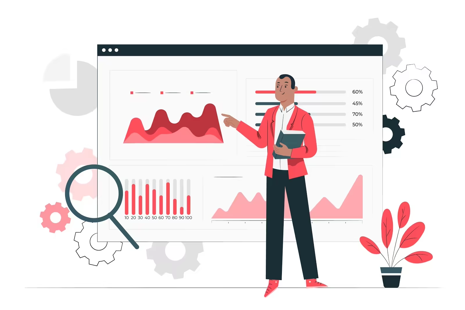
The better understanding of what human resources are what makes the field even more beneficial for organisations. The use of analytics in the field has increased the efficiency of Statistics and the use of data have collaborated with the human resources function to improve the efficiency of an organisation through the use of the people in it. There is a growing interest in the topic of human resources and defining it, is the first step to understanding what it is. According to van Valpen (2019), HR Analytics “is the application of statistics, modelling and analysis of employee-related factors to improve business outcomes.
Why use Human Resources Analytics
The use of human resources analytics allows for the objectivity of conducting business in an organisation and how people affect it. Human resources analytics is also known as people/talent or workforce analysis. Van Valpen (2019), explains that importance of using human resources analytics includes helping the organisational managers in creating a better environment for their subordinates to work in. it is commonly understood that a good and healthy environment allows for maximum performance through factors such as person-environment fit where an individual can thrive to their maximum potential.
Using HR analytics helps an organisation’s management in making more informed decisions, based on the data and facts. The data collected by the managers allows them to make better decisions when it comes to attracting, managing and retaining employees. The importance of retrieving factual information on this is to maximise the return on investment (ROI) of the organisation. From the information produced, managers can create a more positive culture for their employees, which increases and improves staff retention and in turn, maximises the ROI (Microstrategy, 2020).
The reason why this needs to be done is that the effective use of this data and placed initiatives may have a positive impact on the bottom line of the organisation. Many organisational initiatives are top-down, rather than bottom-up. Improving the organisational environment, based on the data derived, would allow employees to be included in some initiatives that are implemented by management. The bottom-line employees are the ones who are on the ground. Improving their work experiences has a large possibility of improving ROI.
Where can you find data for HR analytics?
There are various sources in which managers can learn more about their organisations. Below are some of them, as laid out by Microstrategy (2020).
- Employee surveys
- Telemetric Data
- Attendance records
- Multi-rater reviews
- Salary and promotion history
- Employee work history
- Demographic data
- Personality/temperament data
- Recruitment process
- Employee databases
What benefits can you expect?
Using human resources analytics in the organisation has some great benefits. Usually, these are overlooked until it has been looked into. Using information that has been derived from factual data, makes it easier to function as a business. Additionally, should any questions arise, there is information available to back up certain decisions made and is available for the explanation of decisions.
- Better hiring practices
- Decreased retention
- Improvement of processes
- A more productive workforce
- Improves employee experience
- Improved workforce planning as a result of better and more informed talent development
The most important analytics that manages should know about
Marr (2016), has provided some popular and widely used analytics. These are provided below:
Capability analytics – An organisation’s success is based on the expertise and the skills of that organisation’s workforce. Capability analytics is a talent management process that allows management to identify the capabilities or core competencies needed in a business. An important reminded by Marr (2016). Capabilities are not just about qualifications and skills; they can also include capabilities that may not be formally recognised, such as the ability to develop and maintain relationships.
Competency acquisition analytics - Talent is a crucial part of an organisation and the acquisition and management of talent is often a critical factor in business growth. Competency acquisition analytics is the process of assessing how well or otherwise your business acquires the desired competencies. An organisation needs to start by identifying the core competencies that the business requires presently and in the future. Next, the assessment of the current levels of these competencies within the business and identifying any gaps.
Employee churn analytics - Hiring employees, training them and then integrating them into the business is very costly in terms of money and time. Marr (2016), explains employee churn analytics as to the process of assessing your staff turnover rates in an attempt to predict the future and reduce employee churn. Employee churn can be identified through traditional Key Performance Indicators such as the employee satisfaction index, employee engagement level and staff advocacy score. Surveys and exit interviews are also useful tools.
Corporate culture analytics - Culture is extremely difficult to pinpoint and even harder to change. Corporate culture analytics can be defined as the process of assessing and understanding more about the corporate culture or the different cultures that exist across an organisation. This then allows management to track changes in culture desired, to understand how the culture is changing, create early warning systems to detect toxic cultures in their development and ensure you are recruiting people that don’t clash with the corporate culture.
Human resources analytics is a wide field within the human resources industry. Making use of the data available in the organisation may set the right direction intended to go in. it is factual and there are no assumptions made when using this kind of data to move an organisation forward.
Thandeka Madziwanyika is a Consultant at Industrial Psychology Consultants (Pvt) Ltd, a management and human resources consulting firm.
Phone +263 (242) 481946-48/481950 or
cell number +263 78 318 0936 or email: thandeka@ipcconsultants.com or
visit our website at www.ipcconsultants.com.


