With an estimated seven million blog posts being uploaded onto sites like Blogger, WordPress, and Tumblr daily, it’s safe to say that there is no shortage of competition in the blogging universe. Due to this, bloggers must attract readership by any means possible, whether by catching their eye with punchy headlines or drawing them in with captivating images.
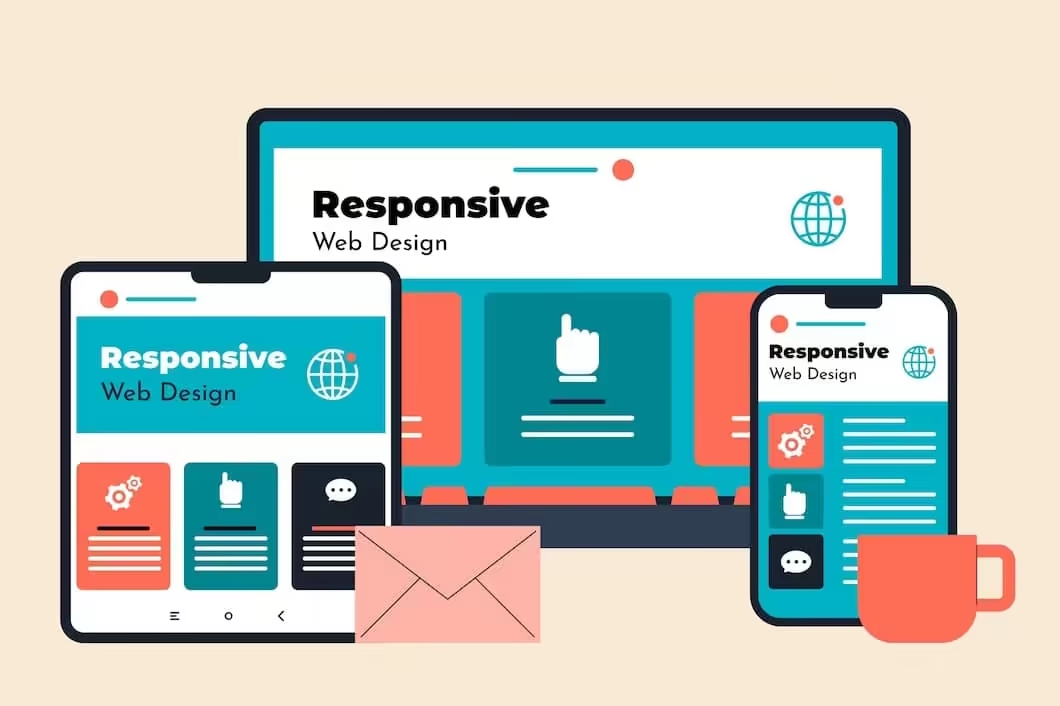
But nowadays, bloggers must rely on much more than just aesthetics. In a world where smartphones and tablets dominate every aspect of our personal and professional lives, optimizing your blog for mobile use is no longer an option – it’s a necessity. With more and more of the population using their handheld devices to access the internet, making your site mobile-friendly is essential so you don’t lose readership and reach your target demographic.
While the assumption behind responsive design is that it takes tons of coding, which can take away the visual appeal of your blog, this is far from the truth! There are many ways to make your blog mobile-friendly while maintaining its professional yet aesthetic appearance, from reducing the size of images using a PDF compressor and sticking to simple designs to using standard fonts and increasing your website’s speed.
So, suppose you’re ready to optimise your business's blog/site for mobiles and tablets while ensuring it maintains its aesthetic value. In that case, we’ve created this article outlining several tips to help you get started. Equipped with this knowledge, you’ll be able to attract/retain readership, increase your online presence, and propel the success of your business in a predominately digital world.
Simplify Your Blog/Website
You might not have noticed before, but when you use a handheld device to browse the internet (like a mobile phone or tablet), each website, blog, or page you click on will be a more simplified version of its desktop version. Condensing your blog down for mobile users allows them to find what they need more quickly as they only see the essentials; therefore, when copying and designing your website for mobile, ensure that you simplify everything.
For instance, if your business is an independent bakery that specialises in sweet treats made to order. If a client were to view your site on a laptop, visitors would see everything they could ever want to know about your delicious confectionaries. Yet, when a customer is using their phone, they don’t want to see all that cluttering their screen; they only want to see the essentials like how to order, product selection, etc.
By eliminating any elements that don’t add to the mobile shopping experience, you create a mobile site that is easy on the eyes, quick to load, and simple to navigate. With a simplified business blog/site, you can keep your readership focused on the information you want them to digest instead of wandering elsewhere. It really is as simple as checking out some online tutorials (watch here to get some inspiration) to build a website that you are truly proud of. And, since technology can severely affect the human attention span, you want to keep them engaged for as long as possible.
Improve The Size Of Images And CSS
Did you know that the ideal load time for websites is between one and two seconds? And if the site fails to comply within three seconds, over 53% of visitors will abandon the page and click on a competitor's link instead. Ultimately, your business's blog/site aims to attract visitors and encourage them to stick around long enough to make a purchase, so if you want to achieve this, you’ll want to pay attention to your website's load times.
While avoiding pop-ups, deleting unnecessary plug-ins, getting rid of ads, and choosing a more specific theme, are all excellent ways to improve your website's loading time, you might have overlooked one of the simplest ways to achieve this – images and CSS. Websites take a little longer to load when using a handheld device to browse the internet because they are designed to fit and load for bigger screens.
Images and CSS are two of the biggest culprits for slow loading times since they require a lot of server space. But you don’t want to eliminate these elements; otherwise, you’ll be left with a dull, plain blog; instead, you should compress them. Compressing your images using a PDF compressor like the one from Smallpdf allows them to load faster without impacting the aesthetic of your site.
Whether you need to compress a PDF or convert files to or from a PDF, they have various PDF tools to help you edit, e-sign, convert, compress, merge and much more. Consider visiting their website to learn more about their different PDF tools and how they could help you make your business’s blog/site more mobile-friendly today.
Avoid Using Pop-Ups And Refreshers
While hijacking an entire screen isn’t subtle, pop-ups and refreshers are an effective way of getting the attention of new customers, peddling your latest discount codes, and making announcements. But there’s just one minor problem with them…everybody hates them. On a desktop, pop-ups aren’t so tedious to deal with because you have a bigger screen to work with, but when using a mobile device, they can potentially cover the whole page.
Nothing encourages a reader to abandon their search faster than a stream of back-to-back pop-ups preventing them from carrying out their online task – plus, have you ever tried to exit a pop-up on your mobile or tablet? It’s nightmare-inducing!
Therefore, if you want to optimise your site for mobile users, it's best to ditch the pop-ups and refreshers. Or, if you’re reluctant to eliminate them, at least pin them to the bottom of your blog/site or deactivate them for mobile users. Alternatively, you could use a bar at the top/bottom of your business's blog to display the latest discount codes, running promotions, and other important announcements.
Include Customer-Friendly Features
Being on the move, customers don’t want to deal with long phone calls or a back-and-forth email chain. Instead, the live chat can provide them with immediate answers so they can take the next step in the purchasing process.
Add A Search Bar
If your business specialises in e-commerce and retails hundreds of different products, consider adding a search bar at the top of your blog/site if you’re considering responsive design. Using the popular online marketplace eBay, for example, there are over a billion estimated active listings. Yet, using their handy search bar, you can skim through thousands of listings in seconds and take advantage of many other convenient features.
And while your business’s website might not rival the product catalogue of Amazon or eBay, installing a search bar can help visitors find the information/product/service they require faster. Some search bars allow visitors to filter the results, which is perfect if it’s their first time on your site and they are unsure what they’re looking for. Ultimately, it creates a better mobile experience for customers and minimises the risk of them clicking off your site because they can’t find what they need fast enough.
Avoid Using Flash
Despite its name, if you want to create a mobile-friendly site, it’s best to avoid using fancy design elements like pop-ups, refreshers, and Flash. While Flash is an excellent tool for boosting interaction, if you’ve noticed your website suffering from slower load times, Flash is likely to be your main culprit!
Since most Flash files are large, the bigger the file size is, the longer it takes your pages to load, which can lead to frustration and more visitors clicking off your site. To prevent this, it is best to optimise the size of your Flash files or eliminate them altogether and replace them with something more mobile-friendly, like HTML5 alternatives.